Programs Used: Adobe Illustrator, Adobe Photoshop
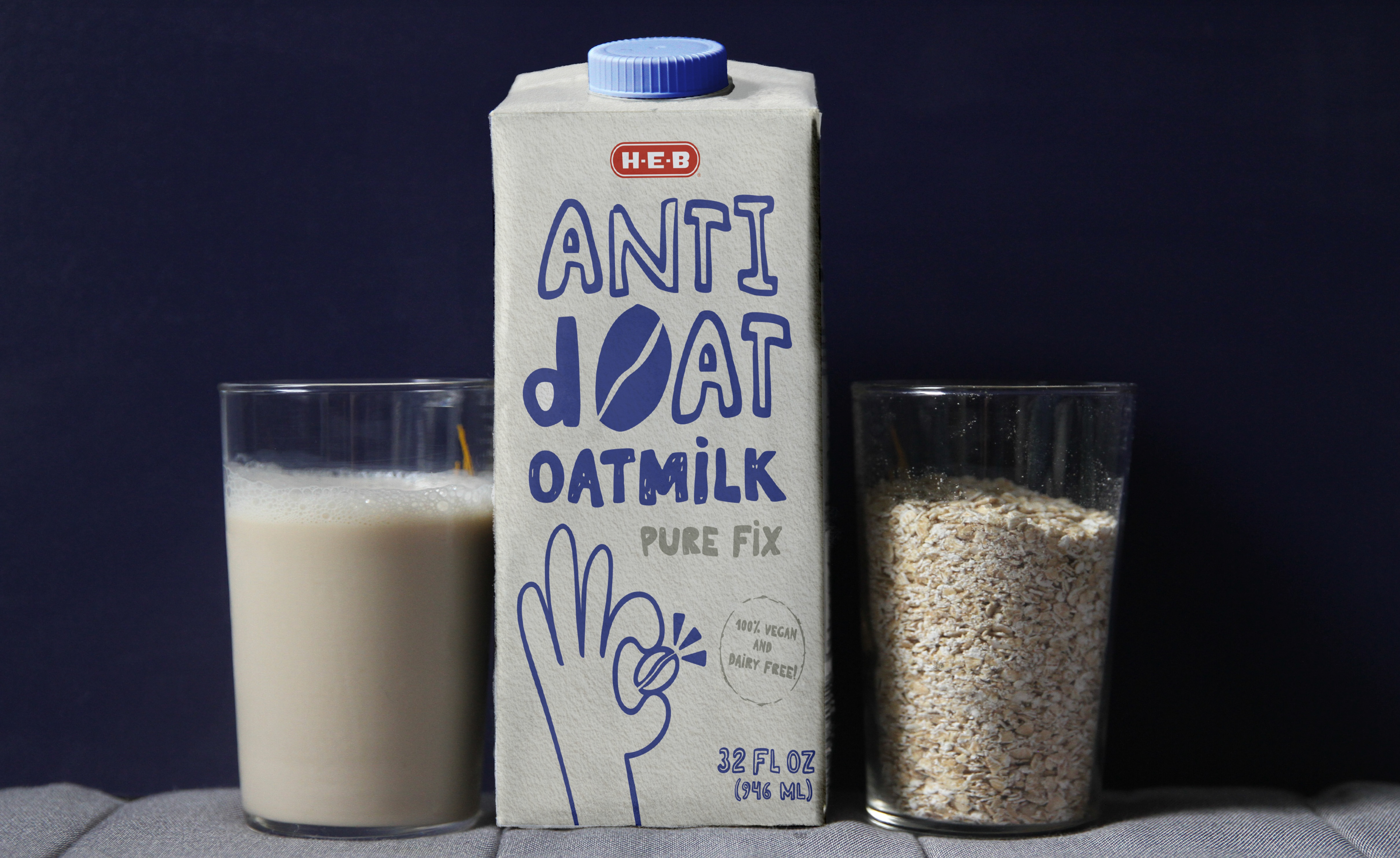
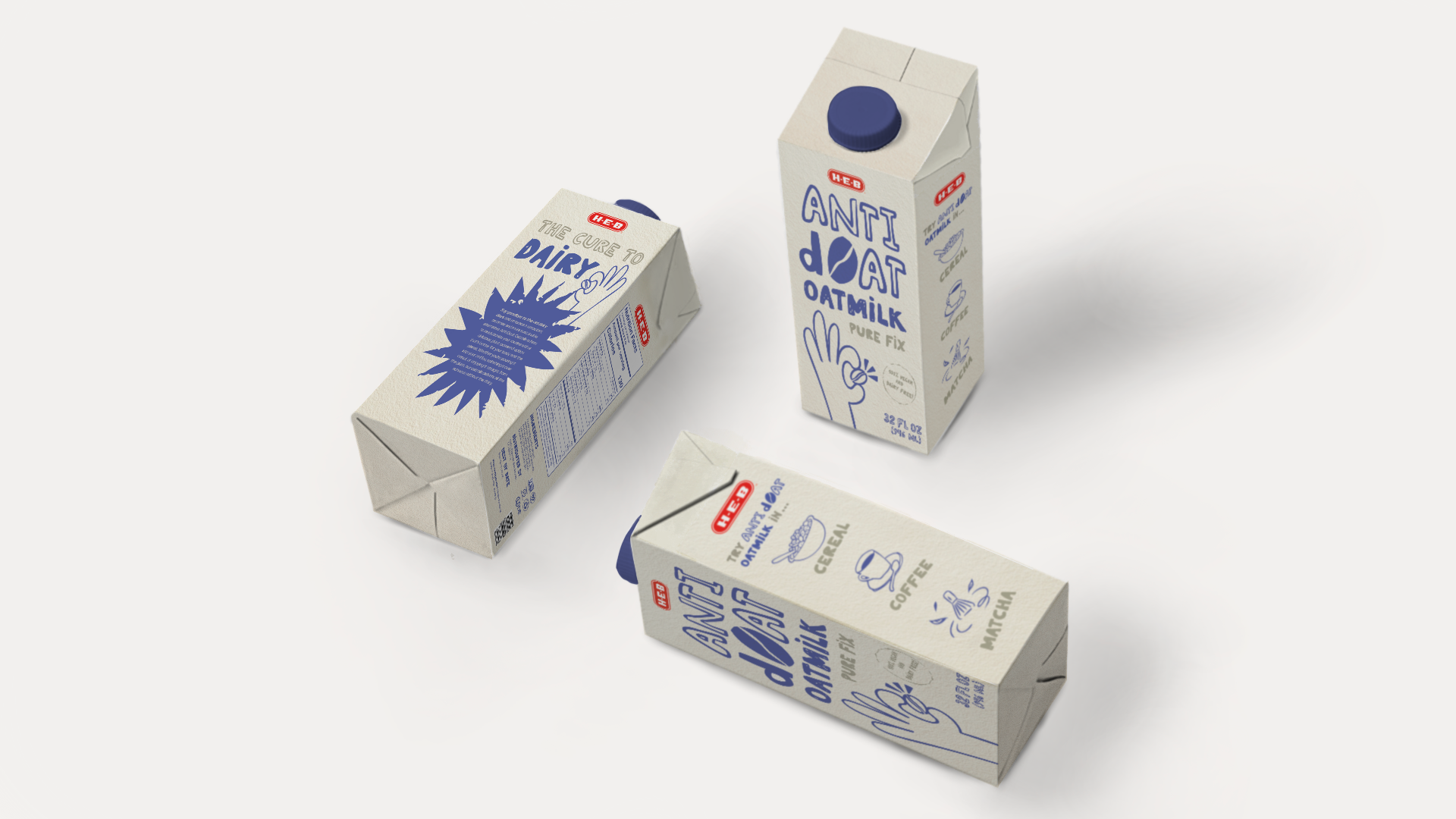
HEB is a trusted brand known for quality, community focus, and innovation, offering affordable private-label products that rival national brands.
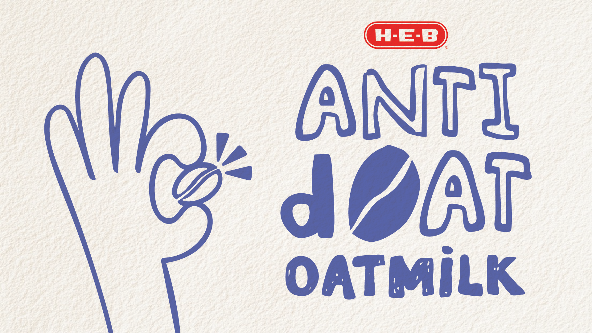
For the packaging concept, Anti dOAT Oatmilk is a brand I conceptualized as a playful take on the word "antidote", positioning oats as the cure or solution to dairy. The design embraces a humorous, approachable tone while maintaining an organic, wholesome aesthetic. It aligns with current oatmilk packaging trends that blend with wellness, making it feel both fresh and familiar on the shelf.
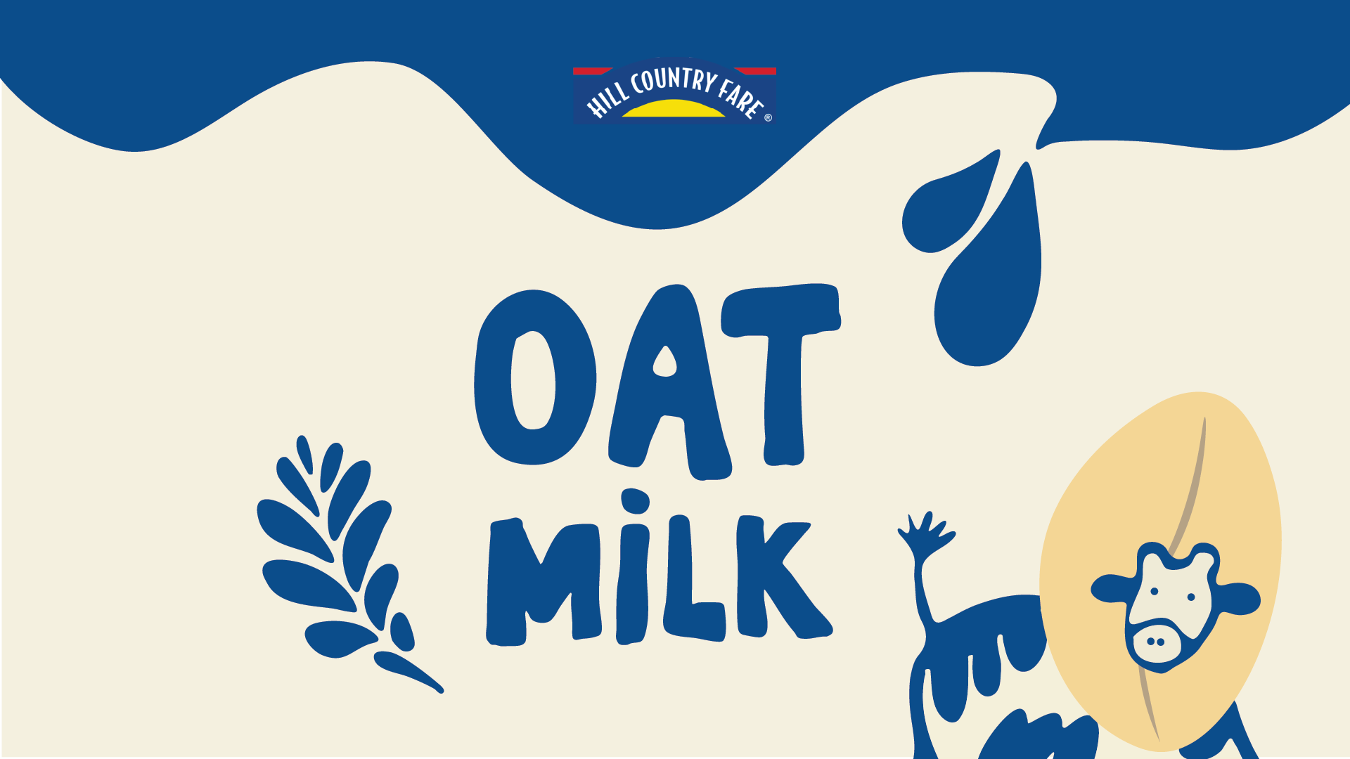
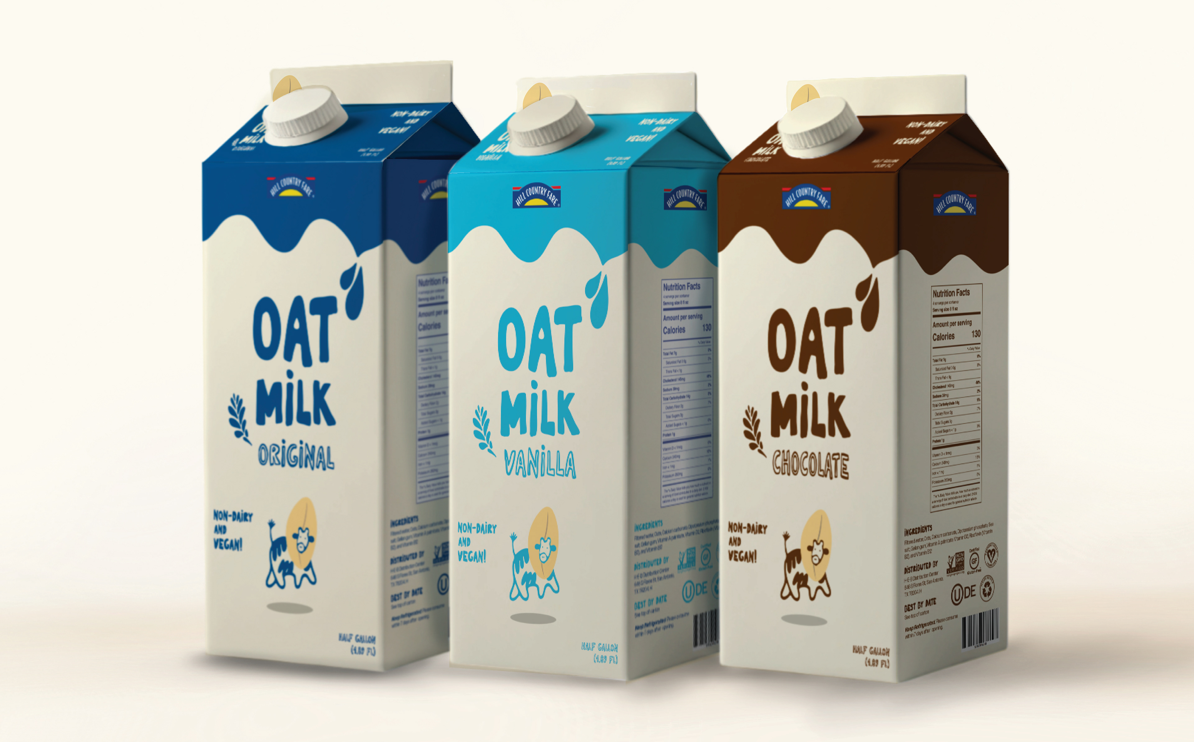
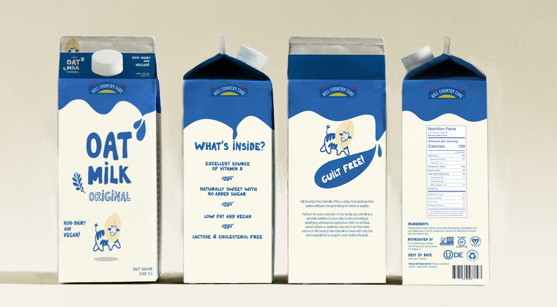
Hill Country Fare is H-E-B’s value brand, known for offering affordable, reliable products for everyday use.
For this packaging concept, a mid-tier take between Hill Country Fare and H-E-B’s name-brand line, I went with a classic milk carton shape and simple, clean illustrations. The cow wearing an oat hat adds a fun visual element that hints at the oat-based twist while keeping the overall design warm, approachable, and easy to recognize.